tl;dr - formerly known as abstract
Based on the FM4-Dataset, a similarity-based artist-recommendation table was calculated. Four approaches were implemented and the results can be pairwise compared.
Additionally, graph-networks were modeled and rendered with Gephi that can be browsed by the blog reader. Between the four approaches diverse results were obtained.
Some technical notes can be found at the end.
Motivation and Description
Having the FM4-Dataset at hand, I thought it would be nice to determine similarity between the artists. Additionally nice network visualizations, like LastFM vis., would also be great.
Sounds good, but as it turns out is not straightforward. One could pursue Collaborative filtering, “direct” Koren et al. or “implicit” Hu et al., van den Oord et al. . Both approaches rely on the people liked this, hence you will like that-method, which assumes a large dataset and that different listeners like similar stuff. Thus the question is: are radio-shows a bag of different “listeners” that like the same stuff?
On my quest I tried 4 different methods. For those in a hurry and who wants to dive into the result immediately, here it is:
Most Similar Artists
The ten most similar artists according to different approaches. By clicking on an artist in the list, this artist will be selected. Input-Box suggests artists from the set. Items that are present in both lists are connected with a line. Most artists are rather diverse over the different methods, but some exceptions like “Blumfeld” and “Jochen Distelmeyer” have to be noted.
General Assumptions
To deal with only the major players, only artists that are played more than 10 times are considered (hence they are played at least once a year). In terms of playtime, the same limitations as in FM4-Dataset apply: Only weekdays and the major time slots: 6 - 22 o’clock.
As the different radio-shows have different lengths in terms of playtime, each hour is taken as a playlist/listener. Additionally this is fair to assume since the radio playlists might be constructed on an hour-basis as there are breaks between the hours for commercials and news (or at least I would do it that way). Hence this is the hypothesis for this blog entry: An hour of radio is treated as a playlist.
All resulting networks were filtered to only contain the most important one for each artist, i.e. the top 10%.
Neighbours
If you want to group artists that might belong together, the first method that comes to mind is neighboring: tracks that are played one after another must be similar or belong together. The nearest neighbors are more similar than the ones with an artist in between. These are more similar than the ones separated by two tracks … etc.
The following figure illustrates the scheme:
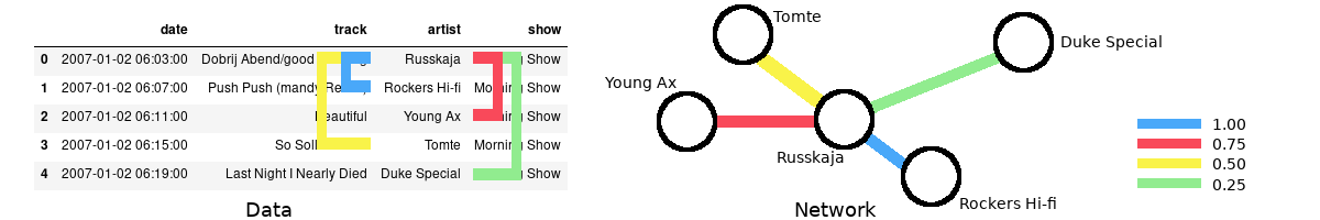
Identifying the nearest neighbours for one artist, left. Resulting schematic network with weighted edges on the right. The node distances are not to scale.
Hereby I choose to consider the four next artist with decreasing weights. Applying this to the hour-based playlist and summing over all pairs, on ends up with a list of artist pairs and associated numbers. A higher number means that they were played often close together.
A drawback of this method is that artists that are played often can easily generate higher numbers since more the nearest neighbours are considered. For example Bilderbuch, has as strong relationship with Arcade Fire and Wanda. Both are popular artists on FM4, but I would only choose Wanda to be played next to Bilderbuch. There are other artists in their top-ten as well, like Skero or Fiva for which the same argument holds.
However, it also produces solid results like Jochen Distelmeyer which has as most similar artist Blumfeld, his former Band. Also, artists like My Jerusalem or Clara Luzia could be considered musical neighbours. That Mark Ronson disturbs the picture is another story.
To eliminate the impact of the number of plays on can reweight the single connections.
Neighbours - as a set
This methodology follows David Kriesel and his Spiegel Data Mining Series (if you haven’t seen this yet, go on and read it. It is pretty good!). The main idea is to reweight the neighbour-connection with its relative importance on each of the artists involved.
Fictional Example:
The number of connections for Bilderbuch - Arcade Fire = 24
That is 60% of the overall Bilderbuch played tracks and 20% of the Arcade Fire number of played tracks. The reweighted connection is then 80%
This way one can minimize the impact of “being a top-dog”. Applying this to the neighbours, next-neighbours … etc collections and then reweight it again with 1,0.75,0.5,.. one ends up with the Neighbours Set result.
In case of Bilderbuch this method reshuffles everything. Arcade Fire is replaced by Blackstreet (yep, No Diggity) and Wanda is swapped for Kornél Kovács. For Jochen Distelmeyer, 50% of the artists remain on the list and the replacements suite better. But that’s is just my opinion.
The huge changing might be related to the imbalance between the number of occasions the artists are played. For a band like Arcade Fire, that was played more than 1000 times, the specific weighting is not as important as for a “one-hit wonder”. For Jochen Distelmeyer the artists in question have a similar overall play weight (up to one magnitude) that might lead to comparable results.
In short, the method seems to overestimate the common people. Some ideas on how this approach can be improved are sketched at end of the article.
Set Approach
One can also tackle the problem from another side. What if the exact order of the playlist is not important, and only the bare existence in an hour is? Thus, there would no greater plan, just music that goes well together. Also, hand-selecting the order of the tracks each day would be a huge workload.
The implementation is straightforward:
- Grab all artists in an hour
- Form pairs
- Weight the connections based on the relative approach from the last section based on their overall counts
Here the total number of connections is larger than in the other methods so far, but this will not have an impact on the top ten list. The results are similar to Neighbours Set approach: Everything is mixed up. Top 3 from Bilderbuch are new artists, only the Jochen Distelmeyer/Blumfeld match seems to be unaffected.
Also on a funny note: David Bowie and Farin Urlaub seems to be a thing.
Implicit ALS
Lastly, I tried Collaborative filtering with Implicit Alternating Least Squares (Implicit ALS). Here the main idea is that the absence of plays indicates a dislike of the user for the artist. However, by at the same time it applies some clever tricks to avoid an over-representation of the absent data.
In a nutshell: Put the user/artist play grid in a sparse matrix and apply some magic (== I refer to the paper for the details). Luckily, I didn’t have to implement the method from scratch and could use the Python implicit module. One of the results you will get is a collection of vectors, representing the artists. By applying the cosine similarity a ranking like before could be achieved.
As a result, one can say that it is another method with inconclusive results.
There seem to be matches between this and the Set/Neighbours Set approach, e.g. Shout out Louds, Tocotronic.
But there are also some misfits like Noah & the Whale and Dioyy.
The similarity between the different approaches might lie down to the fact that both take
the playlists just as a group of items without a specific order.
In total, I think that the amount of date is not sufficient for the task at hand. In comparison, the LastFM dataset contains “only” the top 50 artists for each user, which is more than the hour-based approach applied here can deliver (roughly between 6-16 artists per hour). Maybe a regrouping in terms of show improve the results.
Wrap Up
In my personal opinion, the Neighbours approach seem to work best. One can argue that Arcade Fire doesn’t match Bilderbuch very well, but in comparison to the other results, it seems a better fit. Implementation wise it is also easier than the Implicit ALS.
The inconclusive results can indicate three things:
- The radio-hours are so diverse that now grouping like in the case of LastFM is possible
- It needs more fine-tuning in terms of sampling, i.e. use radio-shows per day instead of hours, or modeling
- There is simply not enough data
The shortcomings of (both) Set-approaches might be fixed by either, taking the average of each node weight, or a total reweighting of the play-counts, i.e. limit the playcount number.
Nevertheless, a broader picture of the results can be helpful.
Networks
What was actually achieved so far is a dependency graph of different artists, which is appropriate to be shown as a network. Here the idea is that each artist is displayed as a node where the connection to other artists are shown as edges, compare with the figure in Neighbours. Furthermore, these edges also have weights assigned to them, which can be used to determine clusters, e.g. which artists belong together, and to layout the overall network. The larger the weight, the thicker between the edge in the rendering.
However, this layout is not unique and there are different methods of how to render these, ForceAtlas2 or OpenOrd. Both are suitable to render huge networks, were the latter emphasises on cluster the nodes.
In the following, these two approaches are compared based on the Neighbours method and discussed for the band Bilderbuch. They have a broad coverage in terms of time in the data-set and are successful, both makes them an ideal candidate.
ForceAtlas2 example
ForceAtlas2 creates for the Neighbours approach the following result :
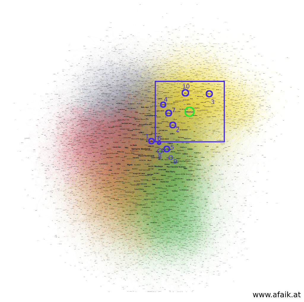
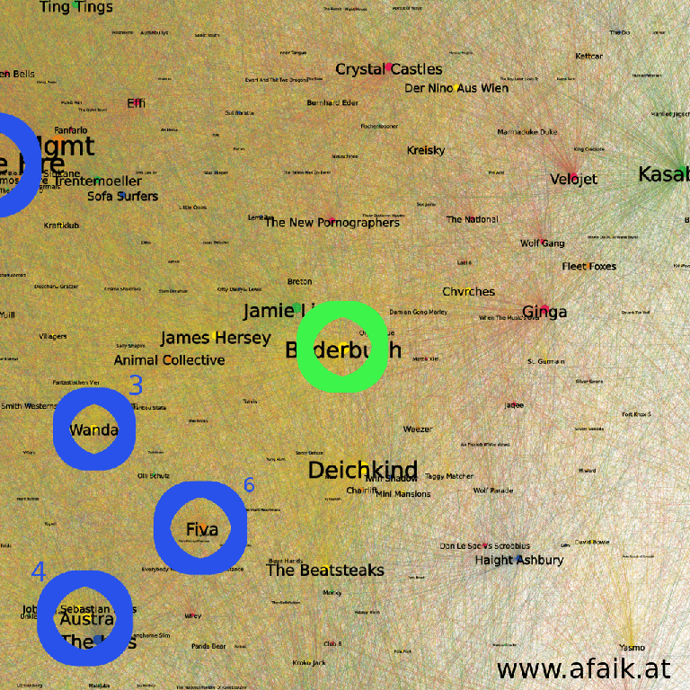
Neighbours layout result. The position of Bilderbuch is indicated as a green circle, the top ten similar artists are shown in blue. Color of the nodes shows grouping result by Gephi.
The top ten artists for Bilderbuch are rather close to them, and every group is nicely packed (colored regions). However, the distance between the nodes is not proportional to their ranking, e.g. the most similar artist is farther away than the 10th similar one. This comes from the edges interaction between all other nodes, that in the layout process pushes nodes slightly away even if they belong together. That way a layout is achieved that shows an overall pleasing result and not a node-wise optimized one.One can look at the subgroup determined by Gephi and try to see a pattern:
Close Up of the ForceAtlas2 layout, color-coding as in the previous figure. Node size scales with the number of plays in the data-set and the node color shows the group it belongs to, according to the algorithm.
It is not straightforward to get meaningful conclusions out of this image. A bias for Austrian/German artists can be noted:
Camo & Krooked, Nino aus Wien, Wanda, Steaming Satellites, Farewell Dear Ghost, Left Boy, Casper … etc.
However one can not be sure for certain, as the band Giantree is not part of this club (upper left corner). I tried to use other grouping criteria like: mostly played in the morning or evening, the number of play-counts, or radio-shows. However, none of these mimicked the grouping determined by Gephi and more features, e.g. release dates of tracks or tour dates, need to be incorporated to make sense out of this grouping.
Take Home Message
Algorithms can determine sub-classes in a network, but it doesn’t tell you why they belong together!
As the layout of a graph is not unique, things can also take another turn.
OpenOrd example
The OpenOrd method showed some impressive results in their paper. However not every approach is suited for each data-set, as the next figure shows.
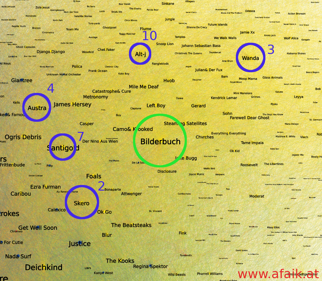
Birdseye view on the Neighbours results, layout with OpenOrd. Same color coding used as in the previous figures. The position of Bilderbuch and its similar artists are shown as circles.
It is evident that the color-grouping is gone and smeared out. In case of this one band, the similar artists are distributed over a larger area. However, in the close up a couple of artists from the ForceAtlas2 example are present.
Close Up of the OpenOrd result, color-coding as in the previous figure.
Reoccurenced are for example: Deichkind, Johann Sebastian Bass or Der Nino aus Wien. Also, some new Austrian/German bands occur like Ginga or Velojet and Kreisky. Hence in the detail, for that example, a similar result but a total different overall picture.Take Home Message
Choose your layout wisely!
But things are not so random as they seem. I tried both algorithms for each method from above and besides the plain Neighbours one, the rest produces similar results. The OpenOrd produces more node-wise clustered results, hence I stuck with that approach.
Hence, without further ado, here are the OpenOrd layouts for the four methods described above for exploring the networks. Enjoy!
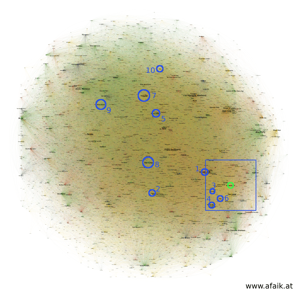
Network - Neighbours Approach
Network - Neighbours as Set Approach
Network - Set Approach
Network - Implict ALS Approach
Stuff that I tried and did not work
During the creation of these visualizations, I tried a bunch of different approaches, that didn’t work:
- The original OpenOrd implementation, in hopes to get a more clustered results, as the Gephi implementation lacks the multilevel approach described in the paper. However not only, did it not show more clusters for my data, but also added lots of overhead with re-importing into Gephi.
- Gephi Toolkit to use Gephi from a custom program to avoid performance penalties from the rendering in Gephi.
- Another visualization: tSNE for Implicit Als. Did lead to similar results like OpenOrd in terms of clustering, so was not included here.
Technology Stack
For the graphics and forms in this blog entry, the following technologies were used:
- Gephi
- Leaflet.js
- d3.js
- Jupyter and Pandas
- Implicit - https://www.benfrederickson.com/matrix-factorization/
- Scikit
- Awesomecomplete - https://leaverou.github.io/awesomplete/
- Papaparse - https://www.papaparse.com/
Technical stuff
Besides the whole data analytics, the blog entry itself needed optimization. In the first iteration, the html page had more than 18 mb, far too much for handheld devices. And since the maps were rendered as svgs the overall website performance was rather poor.
Hence, a tilemap approach was implemented by using Leaflet.js. Here, the svg is first rendered as a png (more than 10k x 10k pixel large) and then sliced into 256x256 squares that are loaded on-demand. To add zoom, the original image is then shrunk and again sliced … etc. For a smooth zooming experience, the original image needs to be of the form
width or height = 2^zoom x 256 px
and the other side needs to include picture data to achieve a similar dimension. For various reasons, the existing software was not able to solve my problem. Hence a custom solution was needed.
The result is a bash script which uses Imagmagick that renders a given SVG, calculates the maximum zoomlevel possible and slices in a format for Leaflet.js. You can find the code on GitHub.
Found an error or you have something to comment? Drop me a line!